Pictorial Introduction to 'Graphics for The Blind'
No Spatial Elements
next page
At first glance both stomach drawings look alright, but the
second one will actually be much clearer to the blind reader. I'll list
its defects:
pictures ¼ size
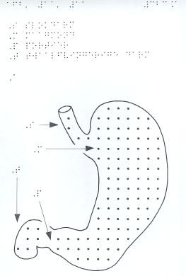
wrong |
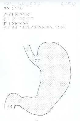
better |
- 1. spatial elements
- The stomach's entrance and exit are drawn spatially, an ellipsis
and an arc: will this make sense to the reader? What will the
ellipsis mean to him? In the second drawing it is immediately clear
what the stomach's openings are.
And besides, the drawing is of a section through: not spatial, not
the stomach taken out, so representing entrance and exit as openings
makes more sense.
- 2. hatching
- A hatch is meant to show something's extent. In the first
drawing the big dots are so far apart that the reader might easily
gather that they are meant to represent something like holes or
moles. Ideally a hatch's elements should not be individually
discernible.
- 3. arrows
- What exactly do arrows point at? Isn't there a choice in 2-3A at
the arrows indicating duodenum and esophagus? Placing one or two
characters in the right place is unequivocal, leaves no room for
doubt. Sometimes an arrow is the only way of identifying an element,
but I think they should be used sparingly.
- 4. title
- The title is missing. To find out what's in this drawing the
reader will have to look it up in the text volume, or he'll have to
infer it from the names in the drawing. The small addition 'The
stomach' will greatly enhance this drawing's value.
- 5. figure number
- The figure number is split over two lines, 11.11 in the first
line, A in the sixth. Why not simply fig.11.11-A in the first line?
- 6. point 6
- There is no need for point 6 in biology.
go to first
page,
previous page,
or next page
© 1989, 2002 Marco Schuffelen All rights reserved
home
Last modified: Sat Dec 29 13:40:44 PST 2001