TEXT
The rendering of mathematics etc. in a drawing of course has to be uniform with the other text.Formerly most of the text in a drawing, lists of abbreviations etc. were put in the text volumes, but some time ago we have argued at our library that though somewhat more expensive, it is to be preferred to have the graphics volumes stand on their own, so as they can be read without having to look up explanations etc. somewhere else.
But we still expect the text volumes to carry the complete titles of graphic material, reference numbers, and besides that the data that are not essential in reading a drawing, like its source or author.
PAGES
In The Hague we are at the moment experimenting on having related pages face each other, but there are some doubts as to the relief rubbing off and pages going to stick to each other. If these objections are met it's of course quite useful, not having to turn the page to get at the key etc.NUMBERS
The figure or page number is placed at the right-hand upper corner of the page. In general stick to inkprint figure numbers; if missing make them up yourself, preferably relate to chapter and paragraph (fig.3-2 rather than fig.16). Figure numbers are absolutely indispensable for reference in graphics volumes.TITLE
Never forget to put a title title a drawing, to give the reader an idea what's in store; state also what kind of drawing it is: graph, bar chart, triangle, etc. Do not copy inkprint unthinkingly, but have your title say exactly what your drawing is going to show.Occasionally key or explanation of abbreviations might work as a title, like stating what x and y stand for will introduce a graph.
The blind reader will not automatically understand a drawing to be part of a series or an enlargement of a detail, so state those things clearly in your title or at the end of your drawing, 'enlargement detail', 'to be continued on the next page,' etc.
PAGE ROTATION
As we use the A4-format, short side on top, drawings that have more width than heighth will have to be put on a rotated page; rotate clockwise, or else the reader will have to reach over the facing stack of pages. Use some standard text in cases like this, 'turn page to the right' or 'rotate page clockwise'. (My fonts print this line at one keystroke.) Preferably put key and other text (except number and title) in the direction that the drawing is to be read, also when on seperate pages. It is not a good idea to switch direction within a series, but sometimes it cannot be helped.MARGINS
Drawings should stay clear of the paper's edges. At the left side a margin of about two centimeters will have to be kept clear for binding; on the other sides a space of about one centimeter is best left open to avoid losses in xeroxing. On a facing left-page the 2cm margin will be at the right of course.Unfortunately our plotter restricts us to a height of 27.2cm anyway.
START
I prefer to begin a drawing by putting down number and title, so as not to encounter a limitation there after having finished the graphic part. When graphics need all available space I limit text to two, or very occasionally one line.ABBREVIATIONS
Though a complete word will occasionally nicely fill out an area, long words will not point clearly at one element in the drawing, and as they generally take too much space anyway, abbreviations are to be used. We mostly utilize one- or two-character indicators in relief graphics. For ease in reading, try to work out abbreviations that still show something of the original word. Try to use existing abbreviations.List the abbreviations and their explanations in alphabetical order, or, if you really understand what a drawing is about, in the order it should be read. Sometimes part of the inkprint graphics, like numerical values, can be incorporated in this list of explanations.
Remember that braille characters a-l cannot stand on their own, but need something like a preceding point 6; and be careful about employing mathematics-code characters in math and physical sciences figures.
LINES
In hand-draughting we utilized pens of .25mm, 1.0mm and 2.0mm width, resulting in three clearly different lines. In plotting Autocad, for technical reasons we only use one pen, 0.5mm width, so we lost the very thin line. In some cases, like grid in graphs, we now use a fine dotted line, preferably about 3.5mm interspaced (See Appendix Autocad ).HATCHING
Hatching is what I call filling in areas ...To use in hatching, I've been looking for patterns that are clearly different from each other to the tactile reader. Tests with blind colleagues resulted in this set of eight. I do not object to other types of hatching, but I'm afraid it will be hard to find another clearly different pattern.
- Useful Hatches in AutoCAD (ca 80K)
Line might look like real lines in a drawing, so use this pattern sparingly to avoid confusion, especially in mathematics. The medium dots ('jan') might look like braille.
For larger areas, shading is preferred over filling in with abbreviations.
- Shading or Abbreviations?
- inkprint
(ca 40K)
- abbreviations (ca 45K)
- shading (ca 65K)
- abbreviations (ca 45K)
Lines through hatching will not be very clear, so don't follow the original drawing or leave room around the lines. (See also Arrows, below in this chapter.)
- Edit your drawing to avoid lines through a hatching
- example #1
(ca 50K)
- example #2 (ca 55K)
Counter-highlighting is what I call putting a hatch around
the relevant area, leaving the unshaded area standing out
(.. blankly.) This also allows
for writing text or identifying characters in that area.
But usually there
is so much more blank space on a page that it doesn't work to identify
smaller areas.
- counter-highlighting, (ca 70K)
- Hatching and Borderlines
- with borders
(ca 80K)
- without borders (ca 80K)
Take care your hatches stand at least the minimum distance (2.5mm) clear
of each other and other elements, or they won't be clearly discernible.
The small-dots pattern feels a bit like the hatch in the plastic
thermoform maps indicating surface water, so I generally use this one for
surface water, and also in fluids, cells, living tissue etc., water
interpreted broadly.
Solid hatching, a completely black area is only a waste of time and ink,
as in relief it will feel the same as a crosshatching like net 15.
(In hand-draughting we of course filled in solid by
brush and ink.)
I think small areas are best hatched in this pattern.
The hatches not readily available in Autocad but of my own making have
been named after my colleagues. See also Appendix
Autocad .
FILLING IN
Sometimes a line in an otherwise clear field in inkprint is an edge, an outline: the blind reader on encountering a form like this will only recognize it as a line, not as a form: so I think forms, shapes had best be hatched.Look for example at the Venn-diagrams below. Inkprint shows two ellipses, sets of numbers. Imagine a blind person reading a faithful copy, coming across lines and numbers, but what do they mean? "Ah ... here's a line ... I feel a dot ... and a number ... lines crossing ... a dot and a number ..." The ellipses will just be curved lines, and there appear to be some numbers in the drawing. I think sensible editing can make a drawing like this a lot more meaningful: by hatching the sets in different patterns, explaining these patterns in a key and stating 'Venn- diagram, two sets' in the title, of course.
Also note that in the braille version there are no dots next to the numbers: the numbers 'represent themselves.'
- Filling In To Show Sets (Venn Diagrams)
- inkprint
- faithful copy
- edited version
- faithful copy
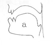 Another example of the need to fill in spaces because the vision impaired
reader does not easily recognize lines as indicating shapes is this ugly
picture of the shape of the mouth forming letter 'a'.
Another example of the need to fill in spaces because the vision impaired
reader does not easily recognize lines as indicating shapes is this ugly
picture of the shape of the mouth forming letter 'a'.
- Filling In Shapes
- faithful copy (ca 20K)
- edited (ca 80K)
- Showing an Outline: Arrows or Filling In?
-
inkprint: arrows (ca 15K)
- Braille: filled in (ca 65K)
CLEAR SPACE AROUND BRAILLE CHARACTERS
Braille characters should not be touched by lines and be sufficiently clear of other elements in a drawing.Imagine some lines of braille text. Single out one or two characters. Draw straight lines around the chosen characters at the nearest points in the surrounding braille characters, left and right, above and below. The rectangle shows the amount of exclusive space a braille character needs. Distance to the lines above or below is about 4mm, to the left or right 3mm, diagonal 5mm. In Autocad I've developed small boxes, to be inserted in the drawing, showing the amount of exclusive space needed for 1-7 characters, see appendix Autocad.
Take care with initial or final characters that do without a complete row or column of braille dots, like character l or the capital sign: despite the open space the same area should be cleared as around a full character.
The Braille Alphabet
DOTS
Sometimes a graph shows fat dots, points, or in maps cities will be represented by dots or small circles. I prefer to leave out these dots and put the indicating character in its place; except of course when a high degree of precision is called for, but that's rare.ARROWS
 I try to avoid arrows by placing the indicating phrase in or
close to the item, or by using key,
but sometimes pointing an arrow is the only way to put
a name to an element in a drawing. Employ a solid triangle and don't
leave out the tail on the short side,
the triangle without it doesn't work; when cramped, a V-shape arrow will
do.
I try to avoid arrows by placing the indicating phrase in or
close to the item, or by using key,
but sometimes pointing an arrow is the only way to put
a name to an element in a drawing. Employ a solid triangle and don't
leave out the tail on the short side,
the triangle without it doesn't work; when cramped, a V-shape arrow will
do.
- V-shaped arrow
- exhibition walk (ca 70K)
In busy drawings, clear a shaft around the arrow and its tail; sometimes this calls for an accompanying unaddled copy drawing (see figures overleaf).
- Clearing Shafts for Arrows
-
full drawing (ca 80K)
- space cleared for arrows (ca 80K)
KEY
If a key is needed, put it where it will be read ahead of the drawing proper. If it has to be in another place, notify the reader of this in your title. The columns of a key shouldn't be too far apart. On a page that's to be rotated, the key should preferably be written in the drawing's direction.STARTING POINT
Some drawings show a sequence of events, a progression or a flow of things. The sighted reader will find the place to start reading in no time; not so the blind reader, so either edit your drawing to have this starting point at the top left of your drawing, where the blind reader starts reading, or indicate its location in your title.- Drawing Edited, Sarting Point Moved
- example (ca 80K)
- Starting Point Indicated
- inkprint
- braille
go to first page, previous page or next page
© 1989, 2002 Marco Schuffelen All rights reserved
Questions? Comments? email me Last modified: Thu May 15 10:29:15 PDT 1989